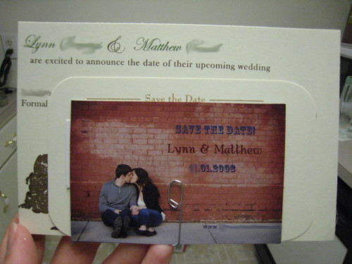
With the wedding still a whole year and eight days away (three months flew by quick!), I definitely think we need to send out save the date cards, at least to our friends and relatives who will have to plan flights and hotel stays in order to attend. And with the way gas and jet fuel prices keep climbing, it's the courteous and right thing to do.
So I've been thinking a lot about what my Save the Dates should look like. I feel like STD's set the tone for the wedding and will carry the motif and theme along (if you choose that). Since I'm all about designing my own stationery, even though I'm no graphic designer, I want there to be a cohesive feeling between the Save the Dates and the Invitations. I could go the "easy" route and get matching sets from vendors like Wedding Paper Divas or Minted.com, but to me, even though they have gorgeous stuff, feels impersonal when I think of other brides that might have my same design. It just doesn't sit well with me.
I've seen some great design ideas from other bloggers out there:
Kate's Wedding (aka Miss Pomegranate)

Miss Cupcake

an Excited Bride (aka Miss Coconut)

Stinkerpants (aka Miss Cream Puff)


So cute! The Bees are really so creative! Just turned out that a lot of my favorite Knotties/blogger-brides our there turned out to be Bees on WeddingBee! I want to be budget friendly, while cute, creative, and cohesive. I have a couple ideas that I will share next time...
6.10.2008
Project: Save the Dates Part I
Labels:
announcement,
engagement,
planning,
project,
save the date,
wedding
Subscribe to:
Post Comments (Atom)

No comments:
Post a Comment